





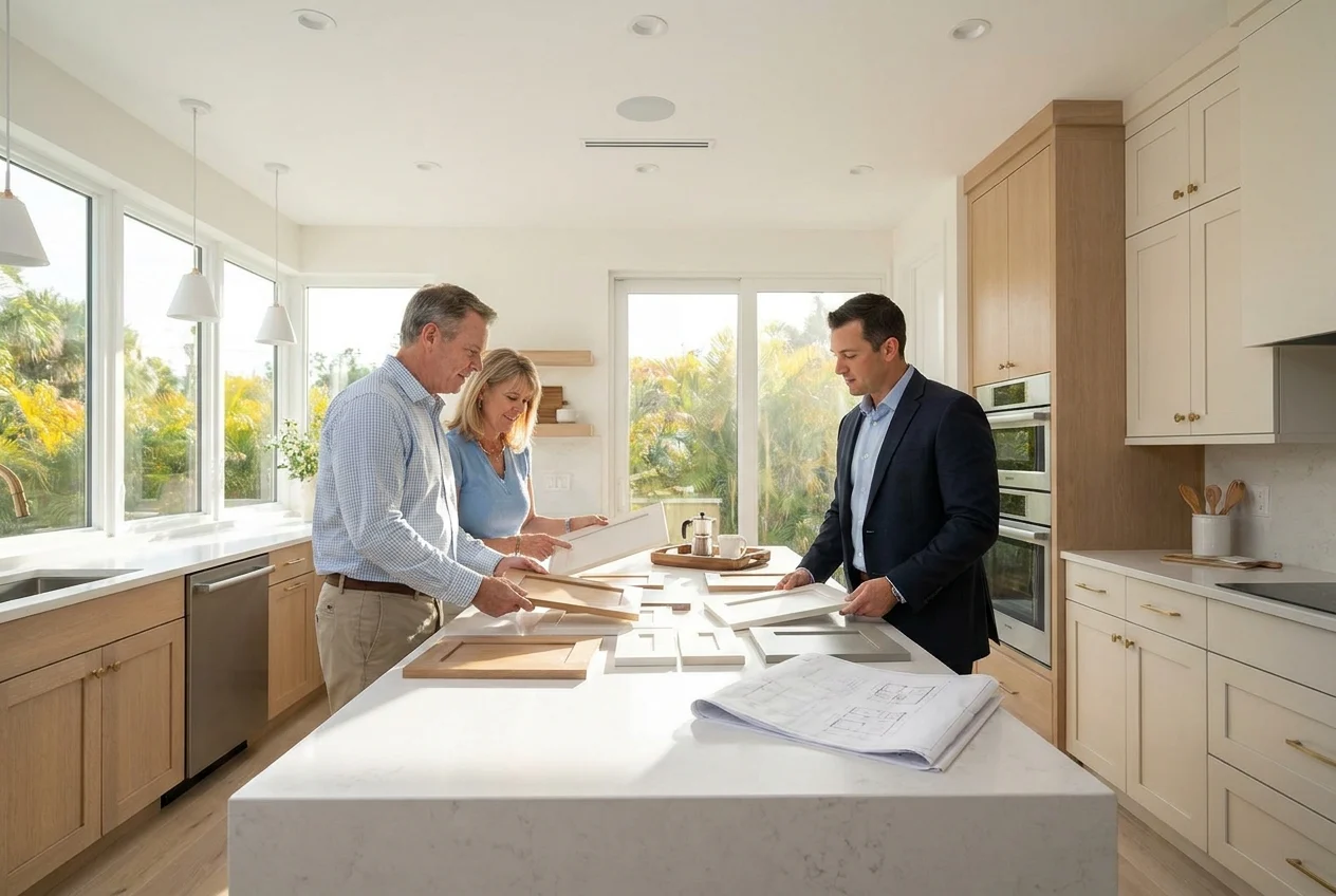
Cabinet refacing can give a Florida kitchen a fresh appearance while preserving cabinet boxes that remain in good condition. Choosing the right color and finish is especially important because strong sunlight, coastal influences, open floor plans, and warm weather can affect how cabinetry looks and feels.
For homeowners in Venice, Florida, successful refacing choices balance current preferences with lasting appeal. The door style, color, and finish should complement the countertops, flooring, backsplash, hardware, and natural light while supporting everyday use.
What Florida Homeowners Should Consider Before Selecting a Cabinet Finish
Florida kitchens often receive abundant natural light, which can make cabinet colors appear brighter or warmer than they looked on a sample. Direct sunlight may emphasize yellow, gray, blue, or green undertones that were not obvious in a showroom.
The home’s style should also guide the selection. Coastal interiors often benefit from light, relaxed finishes, while Mediterranean, transitional, and contemporary homes may support deeper colors or stronger contrast.
Account for Humidity and Everyday Maintenance
Although indoor climate control helps protect cabinetry, Florida humidity makes material quality and proper installation important. Refacing materials, adhesives, doors, and drawer fronts should be suitable for a busy kitchen and installed carefully for a durable, consistent result.
Maintenance preferences matter too. Smooth finishes are generally easy to clean, but very dark colors and glossy surfaces can show fingerprints, water spots, and dust more readily.
Cabinet Refacing Colors That Work Well in Florida Kitchens
The best cabinet colors suit the home rather than following a short-lived trend. Before choosing one, identify the fixed elements that will remain. Existing tile, granite, quartz, and backsplash materials contain undertones that should influence the palette.
Soft White and Warm White
White cabinetry reflects light and can make compact kitchens feel more open. However, not every white creates the same effect. Bright, cool white may suit a modern room with gray or blue materials, while warm white often coordinates better with cream tile, beige flooring, and traditional granite.
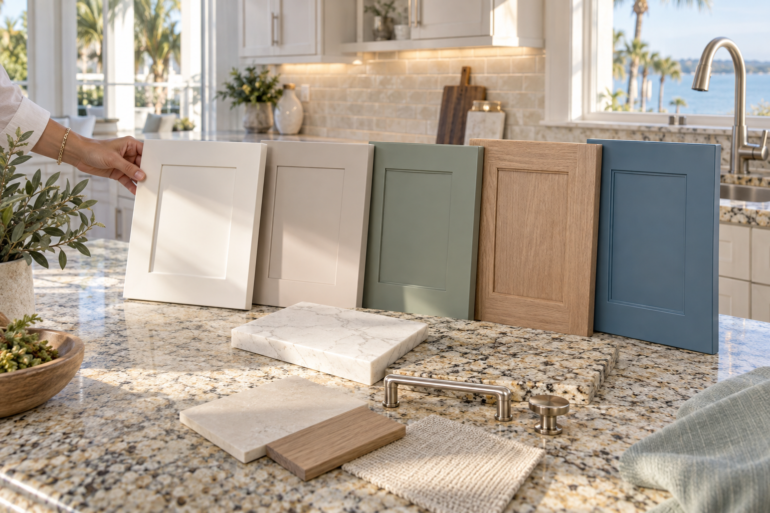
Warm white works with brushed nickel, chrome, matte black, or brushed brass hardware. Pair it with pale quartz for a clean coastal look or add a patterned countertop and detailed door profile for a transitional kitchen.
Light Greige and Warm Taupe
Greige combines gray and beige, making it adaptable to both warm and cool materials. Light greige fronts can soften intense Florida sunlight while keeping the kitchen airy.
Warm taupe provides more depth without making the room feel heavy. Both colors are relatively forgiving in active kitchens and can create a smooth transition between cabinetry and open living areas.
Coastal Blue and Muted Green
Muted blue and green finishes offer a subtle connection to Florida’s landscape without making the kitchen feel themed. Dusty blue, slate blue, soft sage, and gray-green are generally easier to live with than highly saturated shades.
Compare these colors carefully with nearby surfaces. A cool blue may clash with warm granite, while sage can coordinate naturally with cream quartz, light wood, and brushed metal hardware.
Navy, Charcoal, and Deep Accent Colors
Navy, charcoal, deep olive, and rich blue-gray can add definition to a bright kitchen. They are particularly effective on islands, lower cabinets, beverage stations, or pantry walls.
Before using a deep finish throughout the room, consider its size, ceiling height, windows, and artificial lighting. Dark cabinetry absorbs light, so smaller kitchens may need pale countertops, reflective backsplash materials, and effective task lighting.
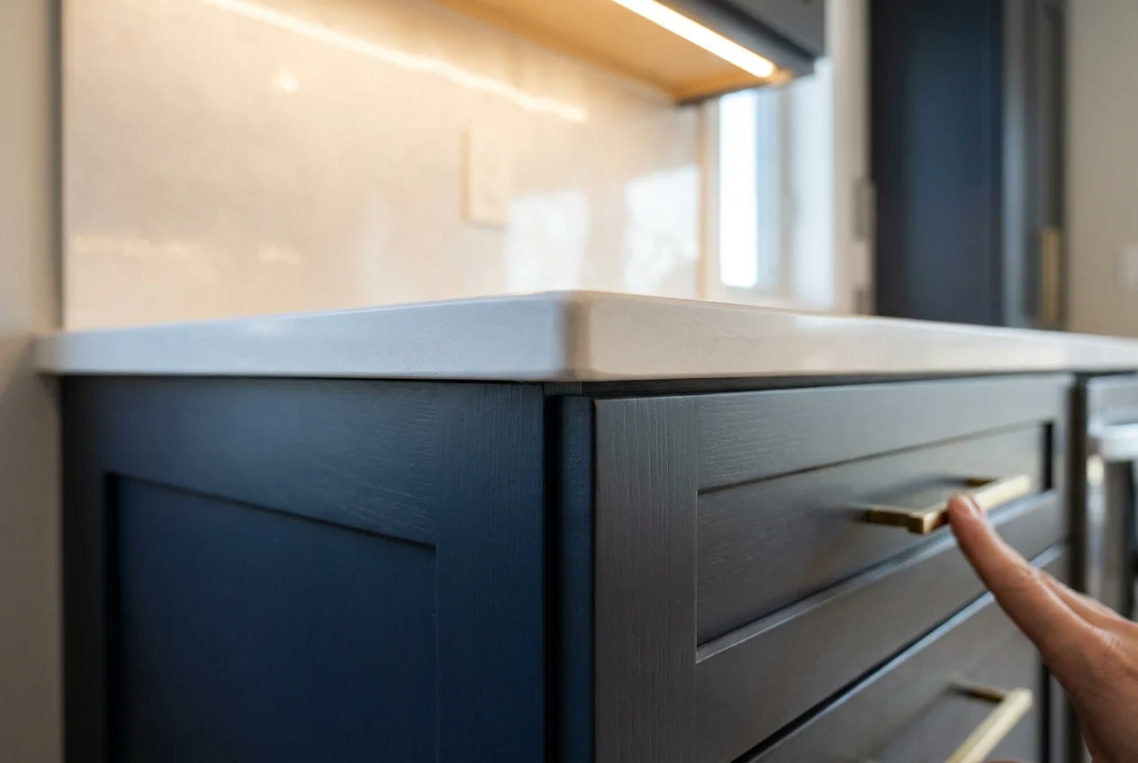
Dark finishes can also reveal dust and water droplets. Satin is usually more forgiving than high gloss, although extremely flat finishes may be harder to wipe clean.
Natural Wood Tones
Wood tones bring warmth and texture to Florida kitchens, especially alongside light stone, neutral tile, or simple quartz. White oak, natural maple, light walnut, and softly stained wood looks feel current without relying on an obvious coastal theme.
Grain direction and consistency deserve attention. Vertical grain can make cabinets appear taller, while coordinated grain across adjacent fronts creates a tailored appearance. When combining cabinetry with wood flooring, choose intentional contrast rather than an imperfect near match.
Choosing the Right Sheen for Refaced Cabinets
Sheen influences appearance and maintenance. The same color can look lighter, darker, cooler, or more reflective depending on its finish level.
Matte and Low-Sheen Finishes
Matte finishes create a soft, contemporary appearance and work well with slab doors, muted colors, and natural textures. Performance varies, however. Some matte surfaces retain oils or show marks in frequently touched areas, so cleanability should be considered along with appearance.
Satin Finishes
Satin is one of the most versatile choices for Florida kitchens. It reflects enough light to look fresh without producing strong glare. For active households, it offers a practical balance between easy cleaning and visual forgiveness.
Semi-Gloss and High-Gloss Finishes
Semi-gloss creates a crisp, polished look but may highlight fingerprints and surface irregularities. High gloss is most common on modern slab cabinetry. It can reflect natural light and visually expand a compact room, but it requires more frequent cleaning.
Door Styles That Complement Popular Refacing Colors
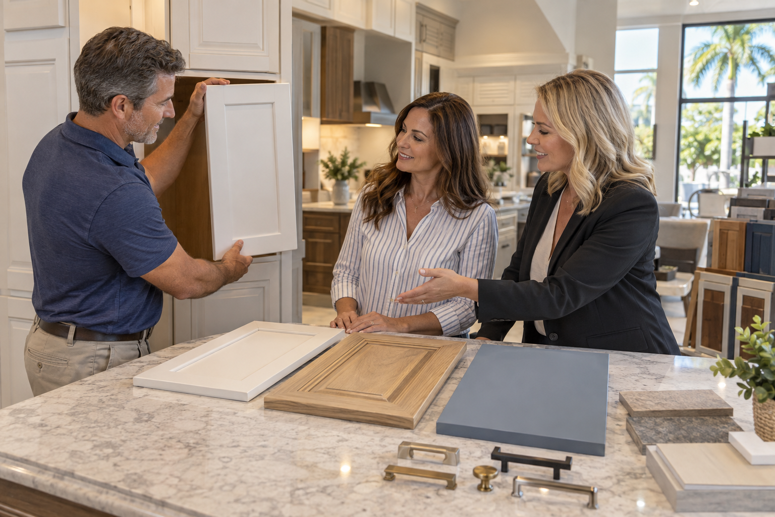
Refacing usually adds a coordinated surface to cabinet boxes and replaces doors and drawer fronts. This creates an opportunity to update both color and architectural style.
Shaker Doors for Versatile Florida Style
Shaker doors work with coastal, transitional, farmhouse, and contemporary interiors. Warm white creates a bright foundation, while navy or muted green introduces controlled color. A wider frame feels more traditional, while a narrow frame produces a cleaner, contemporary effect.
Slab Doors for a Streamlined Look
Flat slab fronts have an uncluttered appearance and pair well with wood grain, matte neutrals, and glossy contemporary colors. Because their construction is simple, material quality, alignment, consistent spacing, and hardware placement become particularly noticeable.
Raised Panel and Decorative Profiles
Raised panel doors can suit Mediterranean, traditional, and formal homes throughout the Venice area. Cream, taupe, warm white, and medium wood finishes preserve their depth without making the kitchen too dark.
Detailed profiles collect more dust and cooking residue. A lightly detailed transitional profile can provide character with less maintenance than a heavily carved design.
Using Two-Tone Cabinet Colors Successfully
A two-tone design can break up a large kitchen, emphasize an island, or connect finishes across an open floor plan. Useful combinations include warm white perimeter cabinets with a navy island, greige uppers with wood-tone lowers, or soft white cabinetry with a sage pantry wall.
The colors should have a clear relationship. They might share undertones, coordinate with countertop veining, or repeat shades found in the backsplash and adjacent rooms.
Consider visual weight as well. Dark lower cabinets with lighter uppers ground the room while preserving open sightlines. A dark island can become a focal point when surrounded by a light countertop and sufficient floor space.
Coordinating Cabinet Finishes With Existing Materials
Refacing allows homeowners to retain countertops, flooring, or backsplash materials that are still in good condition. Careful coordination is therefore essential.
Countertops
Countertops often contain several undertones. Granite may include cream, brown, black, gold, or gray, while quartz veining may lean warm or cool. A quiet cabinet color can balance a bold countertop. With an understated countertop, cabinetry can carry more color or texture.
Flooring
Flooring covers a large visual area. Warm tile, travertine, and honey-toned wood typically coordinate with warm whites, creams, taupes, and balanced greiges. Avoid cabinetry that almost matches the floor. A visible difference in tone or lightness provides clearer definition.
Backsplash and Wall Color
Because backsplashes sit beside cabinetry, conflicting undertones are easy to see. Warm white tile can look yellow beside cool white cabinets, while cool gray tile may appear blue next to cream cabinetry.
Wall paint is easier to change. If a preferred cabinet finish conflicts with the existing walls, repainting may be the simplest way to create a cohesive palette.
Hardware and Fixtures
Brushed nickel and chrome create a clean appearance, matte black adds contrast, and brushed brass introduces warmth. Longer pulls can modernize Shaker or slab fronts, while knobs and shorter pulls complement many traditional designs.
Common Color and Finish Mistakes to Avoid
Choosing From a Small Sample Alone
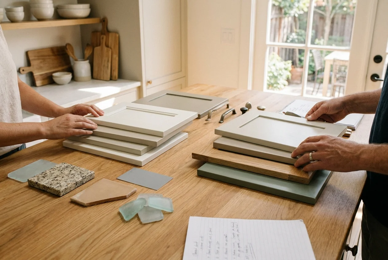
A small swatch may not reveal the full undertone, grain, or sheen. Review larger door samples beside permanent kitchen materials under both natural and artificial light.
Following Trends Without Considering the Home
A fashionable color may feel out of place if it conflicts with the architecture or surrounding rooms. Lasting results come from adapting current ideas to the home rather than copying a design exactly.

Ignoring Preparation and Material Quality
Color cannot compensate for poor preparation. Cabinet boxes must be evaluated, cleaned, repaired, and properly covered so the new surfaces look consistent and perform well.
Overlooking Lighting
Unsuitable bulbs can make a coordinated finish appear dull or discolored. Warm lighting intensifies cream and yellow undertones, while very cool lighting can make warm cabinetry look mismatched.
How to Narrow Down the Best Refacing Finish
Start by identifying which materials will remain and determining their dominant undertones. Select a small group of cabinet colors that coordinate with those fixed surfaces rather than reviewing dozens of unrelated options.
Place full-size door samples beside the countertops, flooring, backsplash, and wall colors. Observe them during the morning, afternoon, and evening because Venice sunlight can change a color substantially throughout the day.
Finally, compare cleaning requirements, sheen, door profile, edge treatment, hardware placement, and durability. An attractive finish that does not suit the household’s maintenance preferences may become frustrating over time.
Creating a Refaced Kitchen With Lasting Appeal
The best cabinet refacing colors and finishes for Florida kitchens combine visual warmth, practical maintenance, and compatibility with existing materials. Soft whites, greiges, natural wood tones, muted coastal colors, and carefully placed dark accents can all work when their undertones are evaluated in the room.
For Venice, Florida homeowners, strong sunlight and open floor plans make thoughtful sample testing especially valuable. Considering color, sheen, door style, lighting, and surrounding surfaces together produces a more cohesive, comfortable kitchen than selecting each element separately.
Which cabinet color and finish will best complement your Florida kitchen?
Contact Cabinet Outlet & More for personalized refacing guidance.
